Experimenting With Brand Directions
For this project, I started with an overarching word cloud of potential target audiences, and organized the terms by spacial context. I managed to form three archetypal audiences, along with the their own landing pages.
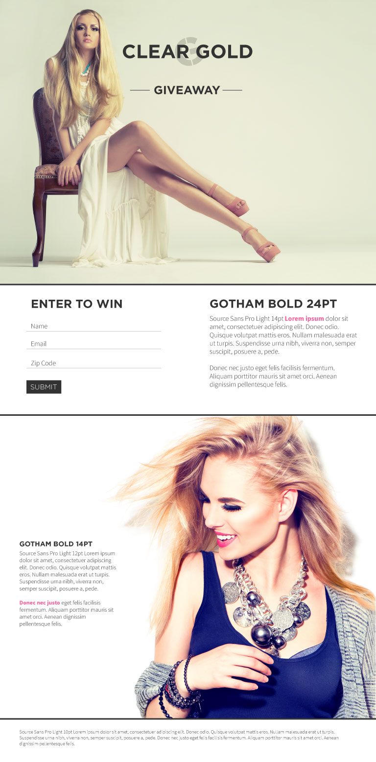
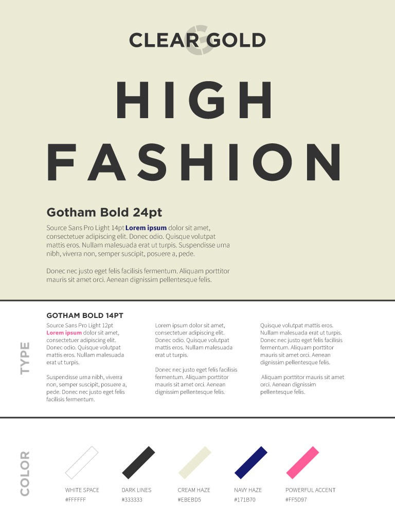
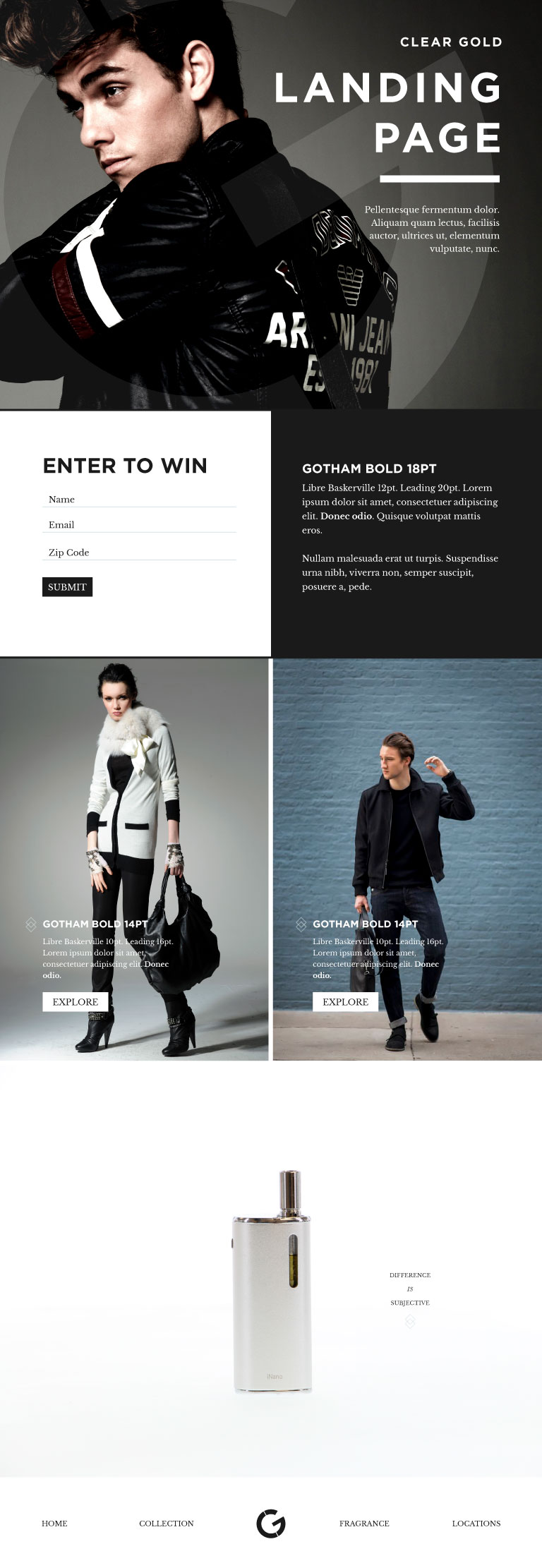
Direction A takes on the high fashion direction. Strong notes with hard edges are applied, along with powerful accent colors used sparingly. The target user is in the fore-front of fashion.
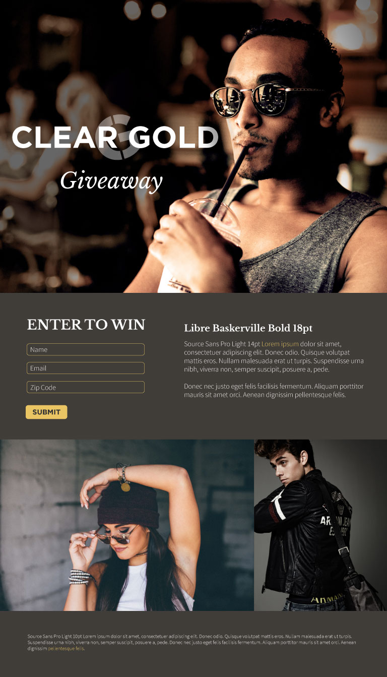
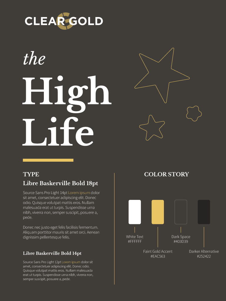
Direction B takes on the high life direction. This darker direction plays on dramatic lighting to focus on the center of attention. The target user is famous and in the spotlight.
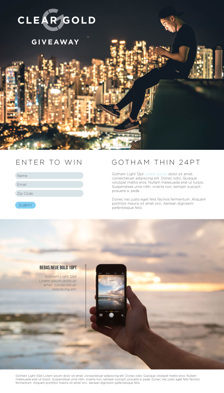
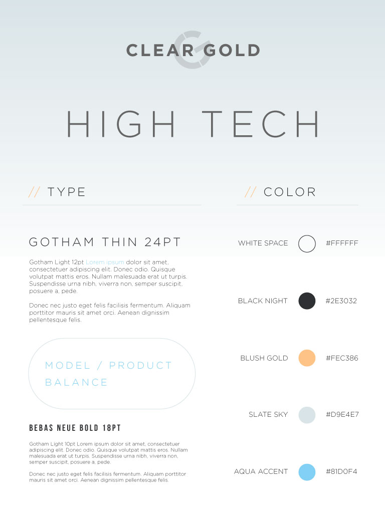
Direction C takes on the high tech direction. Thin lines, light, airy tones build on the trend of the latest technology designs. The target user is an early adopter.
I presented the three concepts to the client, and after some feedback and revisions, I blended a fourth direction.
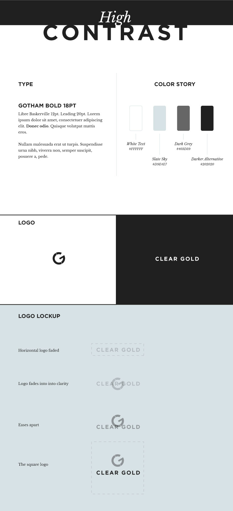
Direction D takes on the high contrast direction. Clear defined sections, blue and yellow hues, sophisticated serifs build on all three directions. The target user stands out from the crowd.