Getting it Right: Mobile Menus
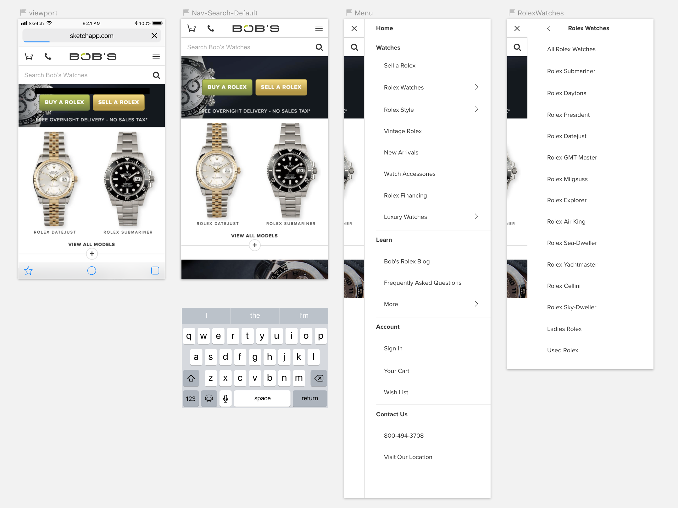
Right side navigation is an uncommon choice. For the western reading world, our eyes track left to right and then downwards when we scan for comprehension. That makes the upper left corner one of the most recognizable locations for functional icons.
On the other hand, the upper right corner also stands as a strong location for functional icons, and it gains the benefit of being accessible for right-handed users. In addition to this, the flow of drilling forwards into a menu seems more natural with a right side navigation. As you progress forward into the submenus, the panning direction feels more natural like turning a page, or progressing into a site. In comparison to the left side navigation mockup above, see how it compares below:
The natural panning direction gives right side navigation the edge, but the conventions of having the hamburger menu on the left corner makes this a risky design choice. I'll be testing this over time in order to see which navigation wins out in my particular audience. What may seem natural to some may feel completely unnatural to others.